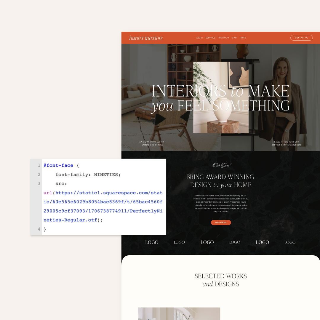
Is Your Homepage A Hot Mess? Here's How To Declutter
We look at and review HUNDREDS of websites and one of the biggest mistakes we see on homepages that are a hot mess - and on websites in general - is copywriting clutter! As business owners running our own show, we can easily get caught up in all the details and give out way too much information. You feel like all the content you have is important, which leads to a hot mess homepage with HUGE blocks of text that make us want to immediately click off.
There have been many, many research studies that all point to the same conclusion: People decide within 3-5 seconds whether they will continue to peruse your website, or click off to a different site. That means that people are making quick decisions about your website and, frankly, do not have the time or brain energy to read paragraphs upon paragraphs of copywriting.
When you have copywriting that clutters your homepage ...
People quickly click off because your homepage is all-together too overwhelming to take in.
The people that stick around miss the large points that you are trying to make because they don't have the time or energy to read through all your copywriting.
You actually create more obstacles in the way of your client or customer to read instead of getting them to the main point - to buy from you or book you.
5 Ways To Declutter Your Copywriting On Your Homepage
1. Cut It In Half, Then Cut It In Half Again
While you may think your website needs 100 percent of your content, your homepage will perform 100 percent better when you can get that down to about a quarter of what you initially thought there should be.
In the book “Don’t Make Me Think: A Common Sense Approach to Web Usability,” Steve Krug says, “Get rid of half the words on each page, then get rid of half of what’s left.” This will leave only the most important information on the page.
2. Make A One-Sentence Mission Statement About Your Business
We call this clear, concise statement for your brand or business a Brand Bio. Longwinded, paragraph-long mission statements on your homepage are a thing of the past. People want to see quick, concise statements about your business instead. Include what you do, what makes you different and how your product or service benefits your client or customer in a clear, concise, one-sentence statement.
Want help with your Brand Bio? Get our FREE Brand Bio Formula to help you craft this statement!
3. Delete Unimportant Navigation Tabs
Many brands or businesses throw all their pages in the top navigation, leaving the viewer to fend for themselves to figure out what to do, where to go and how to navigate the site.
Your navigation tabs should focus on your main programs and offerings. This immediately makes your homepage more clear and actionable. Everything else, including other pages (such as FAQ, Job Opportunities, etc.) should be secondary. You can have these pages linked in your footer, or just linked smaller and less prominently elsewhere on your homepage.
PRO TIP: A good rule of thumb is to cut down your main navigation tabs to about 6 or fewer. This will help funnel your audience and direct them to where you’d like them to go.
4. Delete Extra Words In Testimonials
Hearing an outside unbiased voice can be invaluable, but it must be short on your website. The same rules that apply to your Brand Bio apply here as well. The majority of people will not take the time to read a review that is four paragraphs long so delete any extra words and whittle that testimonial down to one or two strong sentences.
Each testimonial that you include on your homepage should only highlight one theme, benefit or idea. One tangible and memorable point will be more likely stick with your potential client or customer and influence their decision.
5. Make Your Calls To Action Simple And Clear
A call to action is a button or link that tells someone landing on your website exactly what to do next. For example, this button might be below information about one of your offerings and it could say “Book Now” or “Schedule A Tour.”
Even though a call to action is one of the most important elements of a website, you want to make sure to use it effectively and not make it too complicated. The more words or instructions you use, the more confusing it is to your reader.
Stick with something simple like "Book Now" or "Read More." Keep it clear, simple and actionable.
PRO TIP: To determine what you want your call to action to be on your homepage, ask yourself what the end goal of your website is. Is it to get someone to sign up for a call with you? Create a call to action that directs people to schedule with you. Whatever it is, make sure that it clearly looks like a clickable button so that it’s noticeable and recognizable on the page.
PS - We've got a great blog post on How To Create A Call To Action Using Squarespace.


