
10 Ways To Ruin Your Logo
Having a logo is VITAL for your brand, but a good or bad logo design can really make or break how people see your blog or business from the outside. Your logo visually communicates your brand name and your brand style which, in turn, helps to create brand recognition.
If designed well, great logo can …
Clearly communicate exactly what you do in a simple and clear way.
Set a high level of professionalism and credibility for your brand.
Attract your ideal client by using fonts, colors and graphics that appeal to them.
Detract people who you wouldn’t want to work based on the design aesthetic.
While it’s hard to find the formula for the perfect logo, we can tell you where we see people go wrong and teach you how to avoid those mistakes so you don’t ruin your logo.
10 Ways To Ruin Your Logo Design
1. Use design elements (fonts, colors, graphics) with the opposite mood of your brand.
We talk about font personality often at GoLive. Choosing fonts for your brand can convey not only your design aesthetic, but the mood and vibe of your brand. For example, a script font can be romantic and dreamy and might be perfect for a wedding photography brand.
Not sure which fonts reflect the vibe that you want your logo to create? Click here for our Font Vibes Cheatsheet!
Other design items like colors and graphics can set the mood of a brand in a logo. For example, if you are a modern and refined brand, you might want to stray away from bright, primary colors or complicated graphics. Instead, you would want to use a muted, sophisticated color palette and a simple graphic.
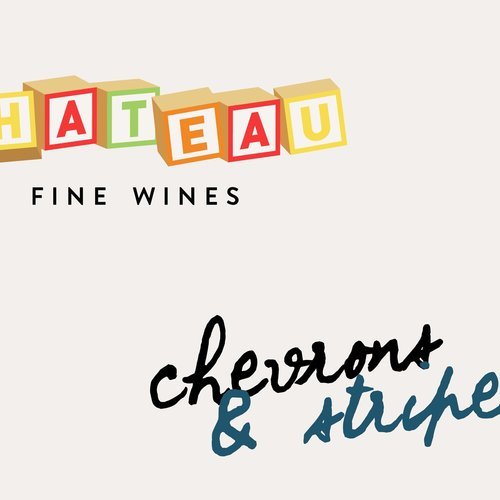
GoLive’s Bad Example: Below you can see a we designed for a fine wine company. A fine wine company is likely going to be a more high-end sophisticated product, but we’ve paired it with bright, colorful and childlike imagery, fonts and graphics. Here, the graphics and colors DO NOT match with the intended mood and vibe of the fine wine brand.

2. Use irrelevant symbols to your business.
One of the biggest mistakes we see is using an element in your logo that requires a lot of explanation because it has nothing to do with your business. This may be a personal attachment to something like butterflies because you saw 16 butterflies the day you decided to start your business. Or maybe a seahorse is your lucky animal, but your brand has nothing to do with the ocean.
It may be tempting to use something with a personal story behind it for your logo, but just because it makes sense to you doesn’t meant it will make sense to your clients or customers. Instead, we’d recommend using something that clearly relates to your business.
GoLive’s Bad Example: Below, we have a logo for a brewery company that has a unicorn symbol in the logo. Based on the name of the brewery, there’s no logical reason for the unicorn to be in the logo design.

3. Use 3 or more fonts.
When it comes to logo design, simple is best! If you choose many fonts in one logo design, it can be really overwhelming to the eye. Instead, we’d recommend sticking with a max of 2 fonts in your logo design.
GoLive’s Bad Example: Below, the logo example is using 3 different fonts in the logo design, which makes the logo look confusing, complicated and busy.

4. Choose a font that is really unreadable.
This one should be an easy one, but we see it a lot! If you can’t read your logo from standing away from your screen and squinting, then it’s likely unreadable. Want a bonus test? Ask your grandma if she can read it! If she can’t, then it’s likely a lot of people aren’t able to read it clearly right away.
GoLive’s Bad Example: Below, the font reads “Chevrons & Stitches” but the script font is a little too distressed and busy for the average reader to view it and understand it quickly.

5. Steal your logo idea from another company.
This one doesn’t require a ton of explanation, but be careful with what you are using as “inspiration” for your logo design. Make sure that you aren’t just copying elements from another brand.
GoLive’s Bad Example: This faux logo is stealing the Adidas symbol for their apparel company’s logo.

6. Use a complex illustration or visual.
While illustrations and visuals can be used in other areas of your marketing or website, we’d recommend keeping them out of your logo. The main reason is that complex illustrations or visuals won’t scale well. Think about how tiny that circle is that shows your bio photo on Instagram. If you wouldn’t be able to see it clearly in that circle, it’s probably too complicated to include in your logo design.
GoLive’s Bad Example: This graphic in the logo should seem to mark a lot of “good” design boxes (it relates to the business and is a pretty graphic!); however, if that paint-like illustration was scaled down, it would be really hard to know what it is. It would be better to simplify the plug and fig illustration.

7. Stretch it out or spin it around.
You could have all the makings of a great logo design, or even have someone create or design a beautiful logo for you, but you could ruin it just by how you use it! If you stretch, skew or rotate your logo, it makes it hard to read. Additionally, it takes away some of the professionalism with your brand.
GoLive’s Bad Example: Below is a potentially simple logo design that looks like a stamp that has been stretched, squished and rotated at an angle.

8. Put a funky background behind it.
One easy way to ruin a simple logo is to layer a bunch of textures and patterns behind it to make it a complex graphic. Instead, always err on the side of simple.
GoLive’s Bad Example: The simple and readable logo design is ruined by a complicated pattern tossed in the background of the logo.

9. Use colors that are really similar so everything looks muddled.
When used appropriately, color can highlight elements of your logo, add personality to your brand, or just add an element of fun. Instead of trying to use too many colors in your logo, we recommend just using a simple pop of color somewhere in your logo.
GoLive’s Bad Example: Below, you can barely read the brand name “Sunny Dayz” because the darker red is too similar to the lighter red. It would be better if the the word was white to provide more contrast.

10. Have more than one main logo.
One error we see often that’s a quick fix is to eliminate extra logos! Instead of having several options that you choose from for your brand, just stick with one! Additionally, after a logo redesign, make sure you do the work to update any old logos you don’t use anymore to your new design. For example: you don’t want your Instagram to have your new logo and your Facebook to have you old one.
GoLive’s Bad Example: In the two logo designs below, there isn’t enough about the logos that make it immediately clear that it’s the same brand. It could just even be similar companies! Rather than making it confusing for your audience, we recommend just sticking with one design.


SIX EASY STEPS TO CREATE A LOGO FOR YOUR BRAND
Now that you know what NOT to do to create your logo, check out our blog post on how you can create a simple wordmark logo for your brand in 6 easy steps (without Photoshop!). Read the blog ⟶
SAVE THIS TIP FOR LATER! PIN THE GRAPHIC BELOW

READ MORE LIKE THIS
See More In Design Tips
Related articles


